Tape 182: Designing A Poster
A while ago I did a deep dive into the history of my own poster designs for all my old shows, from the good to the deeply embarrassing (I actually left out the poster for my first ever work-in-progress show, because it was TOO embarrassing, but maybe that’ll appear in a future newsletter one day). I mentioned there that my approach to this year’s poster was more strategic and collaborative than I’ve been before when it comes to making a poster. Now that we’re very close to being able to reveal the poster itself, I thought I’d say a bit about what that process has been like, in order to cast a light on all the amazing work that goes into a good poster behind-the-scenes. After all, as the famous saying goes, “It takes a village to take a photo.”
(This is not literally true, obviously, please don’t reply to this with snarky comments like “Haven’t you ever heard of pressing a button before, dickhead?” Obviously the pressing of the button is comparatively easy, but due to my needing to be in the photo it was not possible for me to press the button myself. It was therefore necessary to undertake a lengthy collaborative process with multiple other creatives in order to end up with something good. Oh damn I just remembered selfie sticks exist, oh God I’ve wasted so many people’s time, I could’ve done this whole thing in seconds relying only on my singular genius. Oh well, let me tell you how we got here anyway)
The Concept
I spent a lot of 2023 trying out some ideas for a live show called Joz Norris Is Your Private Dancer (A Dancer For Money). It was essentially a format that enabled me to cobble together a bunch of wildly disparate short stories that I’d written in lockdown. It was interesting and sporadically funny, and some of the stories really struck a chord with people, but it didn’t feel like a show, so I abandoned it. It was too obviously just an excuse to present a collection of stuff, and that’s not how I like to make shows. I only really feel like I have a show on my hands once I’ve stumbled across the concept that feels like the engine of everything else, the idea that feels like it will actually generate material and ideas rather than just allowing me to organise pre-existing ones. I found that idea towards the end of the year going into 2024, and I was so excited by it that, when I chatted to Miranda about potential marketing angles, she really latched onto the concept and started thinking about how to build a poster design around it.
The show is about a few things but, at its heart, it’s about wasting time. It’s about letting your life slip by and expecting to be rewarded for something purely because you’ve put the time in, rather than thinking hard about what you really want to do or where you want to go, or what you need to do in order to get there, or whether you even want to get there in the first place. These were ideas I was thinking a lot about throughout 2023, when I felt quite creatively lost and directionless, and Miranda felt that those themes needed to be telegraphed really clearly in the poster because those were themes that everybody would be able to relate to, not just fellow creatives.
So she started sketching some rough designs that suggested these ideas of time-wasting – me sitting at a desk that hangs upside-down, as though time itself has been suspended, a collage-esque idea of me sitting pointlessly waiting in dozens of neutral-looking spaces, as though I seem to have spent an entire lifetime waiting for something to happen.
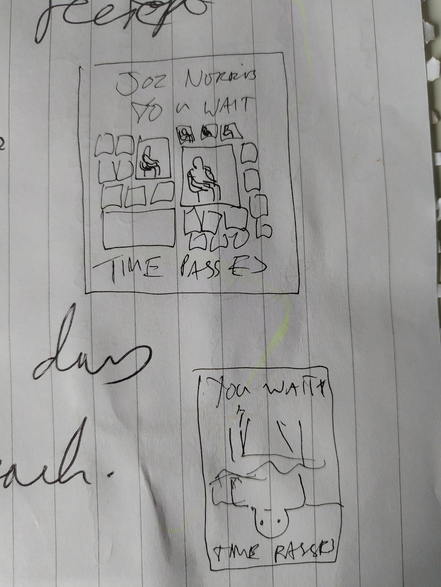
I loved this idea but was worried it might look too busy to work as a poster, too reliant on people stopping and absorbing lots of small details rather than doing something bigger that immediately grabbed their attention. But we loved the narrative of a lost-looking person who was letting their life slip by, so we set about brainstorming ways of condensing that narrative into a single image.
Reference Images
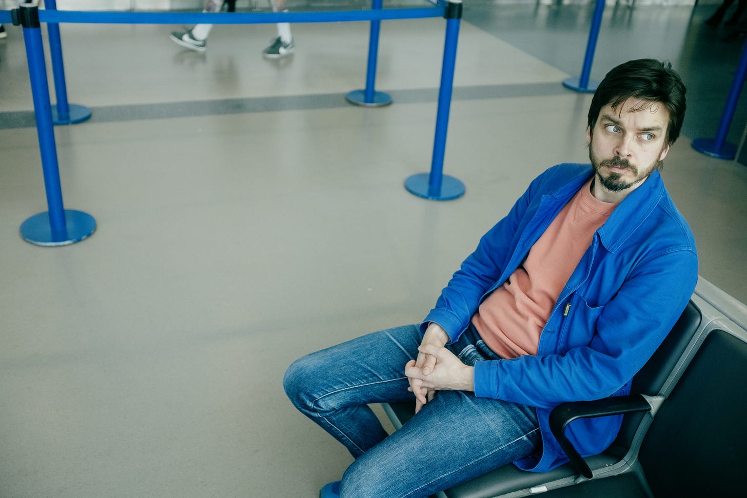
Miranda came up with this concept so early in the show’s development that she was able to take reference photos almost passively, while we were out and about doing other things. When we went on holiday last year, she took some of me sitting in the airport, theorising that airports are classic neutral holding spaces where people sit waiting for things. The tricky thing was going to be finding somewhere that suggested this same concept but that was a bit more aesthetically pleasing than an airport lounge, which tend to be quite grey.
Turning On The Marketing Brain
I’d originally started working on You Wait. Time Passes. thinking it would be a relatively stripped-back stand-up show, but as it developed it became clear that I was once again making a narrative character show, because you can’t help but end up making the kind of thing you make! As such, it felt important to me that the poster communicated this somehow and didn’t just look like a generic stand-up show. Miranda then found a really exciting reference in an advert for a Paul Graham exhibition at the Photographer’s Gallery:
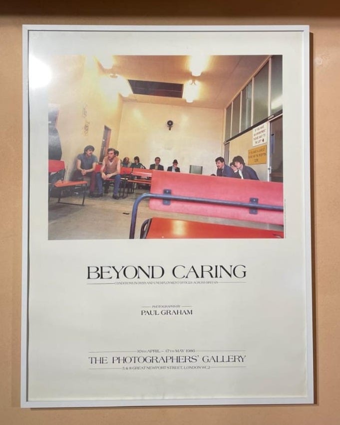
The idea of letting the image itself tell its story completely free of text or logos or superimposed elements, with all the necessary information contained in a border that framed the image like a window, was really exciting. I felt like it would make the show itself look more like a story that was unfolding that we were peering in on, and in that way people would be less likely to come to it expecting a traditional stand-up show. I’d already learned in the first couple of WIPs that when audiences were expecting normal stand-up the show took longer to find its feet, whereas when people came in knowing roughly what they had come to see, it took flight much more instantaneously, so anything we could do in the marketing to help potential audiences do that mental legwork before they even came in was really important.
Because it had become important to us that this poster didn’t just look like every other poster in Edinburgh, but looked like something with some sort of strange story or personality to it, we decided to ask Miranda’s brother, Oliver Holms, if he’d be interested in taking the picture. Ollie doesn’t normally do comedy shoots – he tends to do portraiture and fashion stuff, so all his photos are incredibly beautiful and characterful. But to my delight, he was happy to help as long as I promised I wouldn’t gurn comedically too much, which I was happy to do, committing to a punishing training regimen to help me rein in the comedian’s natural impulse to gurn.
Location & Costume
So now we had to find a location that would make the most of having such an amazing photographer on board. Here I started working with the amazing Queenie Miller, my producer, and the phenomenal Will Andrews, who would be designing the final poster itself. By now we had pinned down the idea of photographing me in a window somewhere overlooking the street and shooting me on a slow exposure so that I appeared completely frozen while any movement in the street outside seemed sped up and blurry, as though life was literally speeding past. So we needed to find somewhere that gave us that vantage point while also having good enough light to take a clear, characterful portrait and which ideally nodded towards the show’s themes with the available decor and specifics.
This was probably the stage where my natural tendency to let things be “good enough” kicked in. I found several locations which would have been fine, but the team were amazing in pushing me to keep looking and try even harder – we would find the perfect thing, they asserted.
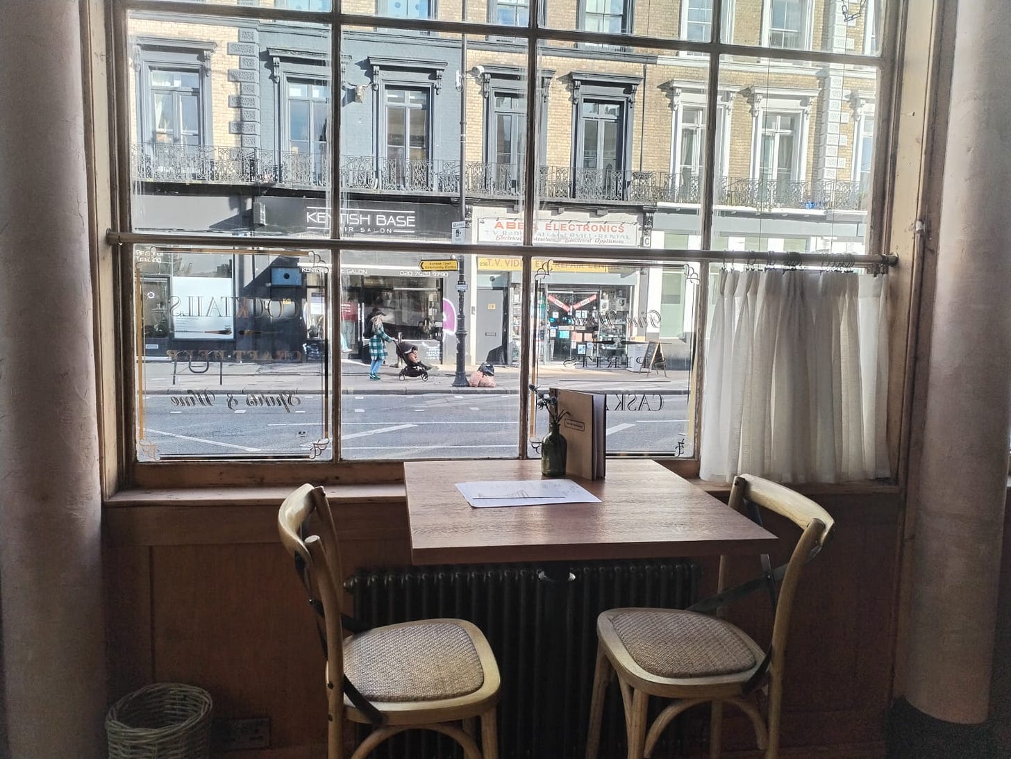
This lovely pub in Kentish Town would’ve been fine. It wouldn’t have been perfect.
Miranda had been steering me in the direction of old-school 60s-style builders’ caffs, because some of them have a sort of frozen-in-time quality that feels simultaneously beautiful and a bit tragic, but we struggled to find any with exactly the right vibe. Lots of them had actually been done up and were now trying to look quite modern, so didn’t look quite right on camera for what we wanted. Then it occurred to us – pie shops. Pie shops still look the way they always have, and there aren’t many of them left. They look inherently antiquated.
We secured an incredibly beautiful pie shop in Hoxton, which managed to look beautiful, ancient, familiar and bizarre all at the same time, and were all set to shoot there. As soon as everyone on the team saw my recce photos of the place, the discussion was over – we’d found it.
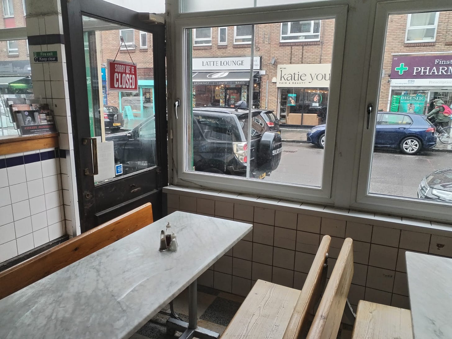
Meanwhile, Miranda had been researching a costume that would instantly look out of place in the pie shop, something that would make me look immediately lost. We managed to borrow a set of amazing vintage pyjamas from Ryan Lane (a wonderful actor and clown himself – check out his work!) and paired them with a massive overcoat as though I was a guy who spent his life slumming around inside his flat, only occasionally shrugging on a coat and going to the pie shop to stare into space before staggering home to bed before doing it all again.
The Shoot
During all of the planning stages, we had been playing with the idea of me simply looking bored, frozen or vacant in the final image, all of which we played with on the shoot and got some amazing shots, along with a few other options in terms of expression or pose. Ollie suggested one final idea, though, which ended up being really unexpected and brilliant and which we ended up going for for the final poster image. I’ve not put it online anywhere yet because we want to save it for the big reveal, but everyone who saw it said it immediately pulled their eye to an unexpected place and catapulted them into the image, and I’m so grateful to Ollie’s expert eye for spotting the opportunity.
Design
Since locking down the shots themselves, Will has done incredible work marrying the depth and character of the image with a really beautiful design, playing expertly with the tension between silliness and seriousness within the image and the show. He’s used really tactile textures and presentation devices in his design, and his layout really guides your eye around the poster in ways that are intuitive and natural. We’ve also really run with Miranda’s initial idea of something resembling a photography exhibition, with the photo itself looking quite weird and surprising, and with Will incorporating some ideas about how the photo interacts with the border in order to give the overall poster a really tangible sense of depth, as though it’s been mounted.
Only this week I was doing some work with Jon Brittain, the show’s director, and we landed on the framing of this show being about someone who has dedicated all of his thinking towards how his life is packaged to other people, with zero thought going towards what he wants the content of his life to be. I was delighted to realise how closely this concept mirrors the decisions we made in the planning of the poster, where a sad, odd, funny, pathetic image is contained inside a frame that makes it look weirdly beautiful.
I love being able to look at the finished poster and see so clearly the fingerprints of so many amazingly talented people – Miranda’s initial concept and tireless exploring of ideas throughout, Ollie’s incredible eye and ability to tell a story in a single image, Will’s amazing design skills and ability to put elements together in a way that feels like you could touch them and communicates information without ever feeling cluttered, Queenie’s inspiring championing and enabling of the whole process and her expert critical eye throughout to help us make the right decisions, even the ways in which the work I’ve been doing on the show itself with Jon and Miranda is so perfectly reflected in the final product.
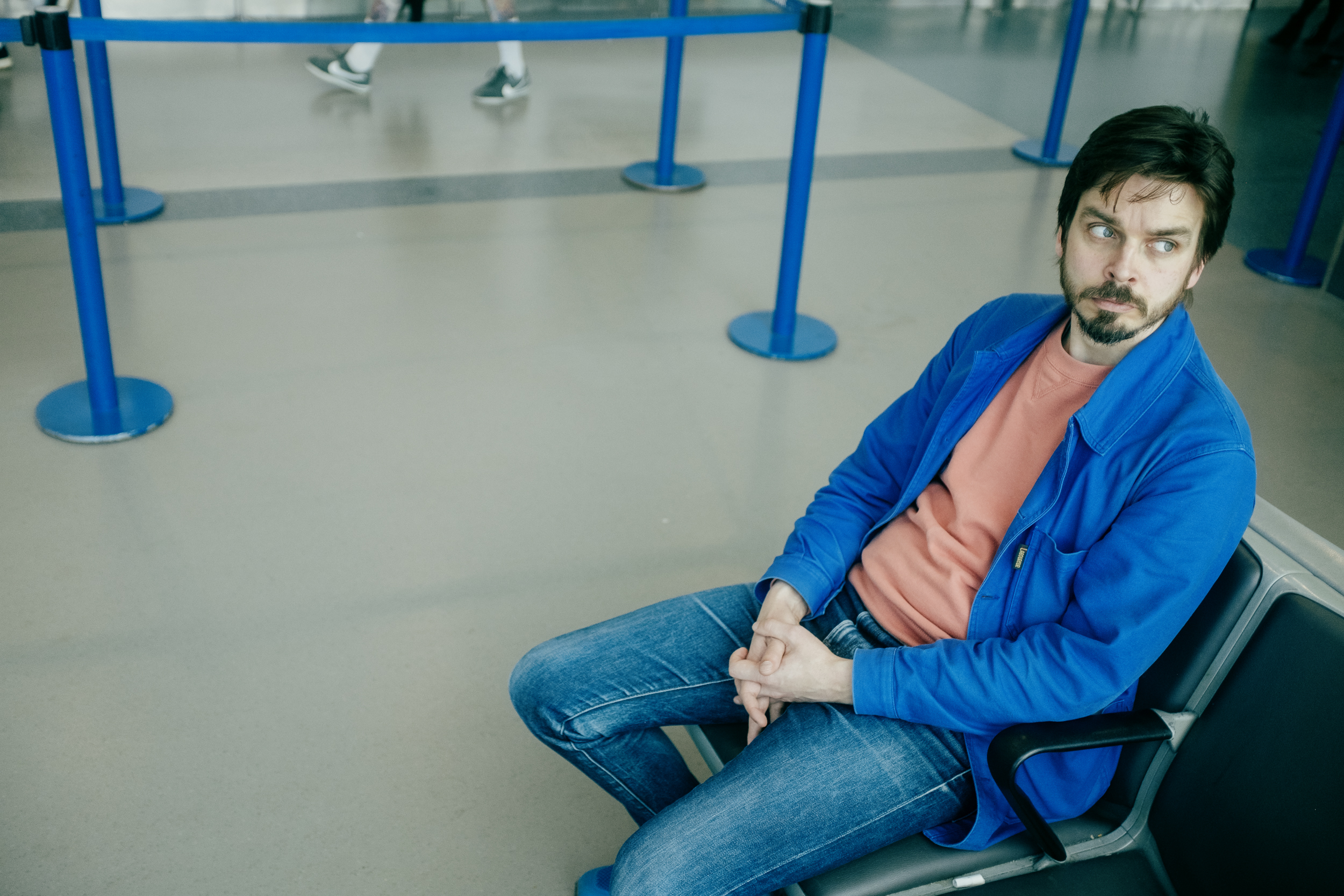
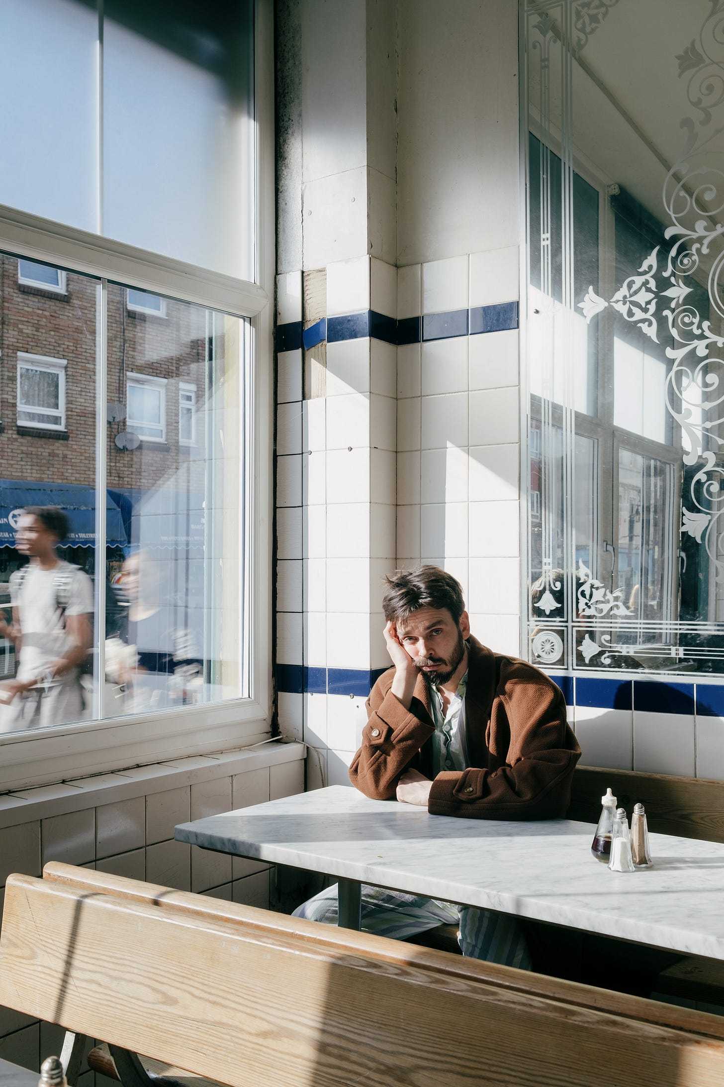
I used to think that the poster was just a big rectangle in which to insert a nice image and a bunch of important information so people knew where your show was happening, and while my understanding of that has slowly shifted, I feel like this show is the first time I really looked at the poster as a full-blown creative process in its own right. I’m so grateful to have had such an amazing team to help me realise it. We’re not quite at the point of being able to publish the final thing, but I can’t wait to show it to everyone. For now, here’s one of the images we took that isn’t the final poster image, but came pretty close and which I absolutely love:
A Cool New Thing In Comedy – I just received an email from a brand new website called FringeRat asking if I would give their new venture a shout-out in my newsletter, and have just been exploring it and it’s a great idea. It’s an archive of stand-up videos from hundreds of comedians performing at this year’s Edinburgh Fringe and it’ll serve you one randomly according to your search filters to help provide a tapas-style sample of shows you might be interested in, and links to buy tickets. Discovering acts at the Fringe can feel daunting and overwhelming, and this website seems a great way to help shows reach new audiences.
What’s Made Me Laugh The Most – Definitely something from the incredible Stepdads’ Les Mis show at the Bill Murray this week, though it’s a tough call which bit to choose. Either Luke Rollason and Tom Curzon’s repeated sandwich gag, or Mark Silcox telling us what it’s like to be a bishop.
Book Of The Week – I’m still reading How To Do Nothing by Jenny Odell, but am also now reading Oliver Burkeman’s Meditations For Mortals alongside it, which is designed as a four-week “mental retreat” where you read a chapter a day. It’s the followup to Burkeman’s brilliant Four Thousand Weeks and has a lot of similar themes to Odell’s book, weirdly – essentially, you’re never going to enjoy your life until you can internalise the idea that you can’t be as productive as society wants you to be, and actually give yourself permission to stop.
Album Of The Week – The Rise And Fall Of A Midwest Princess by Chappell Roan. I’ve finally decided to get on the Chappell Roan hype train. I find it very hard to pin down what my taste actually is in relation to modern pop. I really like the up-tempo songs on this. “Pink Pony Club” and “Femininomenon,” specifically. Her ballads and mid-tempo numbers I’m not as an on board with. But it’s a decent album! I find pop so hard to talk about, I lack the frame of reference for it.
Film Of The Week – Not seen any films this week. Stoked for Lilo & Stitch though.
That’s all for this week! As ever, do let me know what you thought, and if you enjoy the newsletter enough to send it to a friend or encourage others to subscribe, I’d hugely appreciate it! Take care of yourselves until next time,
Joz xx
PS If you value the Therapy Tapes and enjoy what they do, and want to support my work and enable me to keep writing and creating, you can make a one-off donation to my Ko-Fi account, and it’s very gratefully appreciated.
PPS Had a lovely birthday picnic at the weekend, thanks to all who came, we all had fun:
